


How to make an Advertisement Poster
Objectives of Advertisement Poster
Capture Attention+
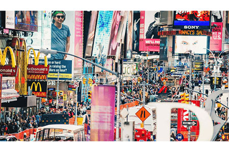
A poster advertisement needs to immediately grab attention with strong imagery or dramatic headlines so the viewer slows down and glances. In a noisy media environment, capturing interest is the precursor to retaining the message.
Convey a Clear Message
Your poster must deliver a concise message within seconds. Whether an event or product promotion, design and language clarity ensure that viewers immediately grasp your intent without confusion.
Promote a Product/Service
Advertisement posters are excellent vehicles to sell a product or service compellingly. With persuasive images and short messages, they call out what's being provided and why it will resonate with the audience.
Create Brand Awareness
A designed poster quietly makes a brand familiar by incorporating your logo, colors, and tone. Repeated sightings through consistent branding make people familiar, which ultimately solidifies customer trust and loyalty.
Encourage Action
All successful advertisement posters stimulate action, whether that's browsing a site or buying a product. A good call-to-action turns passive observers into active players who interact with your brand.
Reach a Target Audience
Designing your advertisement poster with your target audience in focus guarantees relevance. From graphics to words, designing each element to suit each audience ensures your message strikes a chord and hits the right people where it matters.
Establish Emotional Connection
An effective advertisement poster creates an emotional connection by matching imagery and tone to the desires or issues of the audience. This emotional touch boosts engagement and makes the message more memorable.
Steps to create an Advertisement Poster
Define the objective and target audience
Begin with defining your goal and knowing your target audience. Knowing whom you're addressing determines the message, tone, and appearance of the poster to fit your campaign objectives.
Choose the right poster size and format
Choosing the right poster size and type is based on where and how you plan to post it. Digital or printed channels call for varying layouts, resolutions, and ratios for maximizing visual effects.
Craft a compelling headline
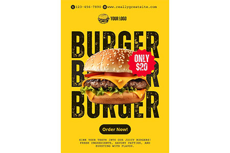
A great headline is your poster's hook. It must be punchy, pertinent, and irresistible, drawing viewers to stop and investigate the content further within seconds of glance.
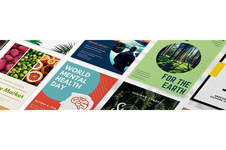
Use high-quality visuals or graphics
Spend money on top-quality visual or graphical content to make your poster stand out. High-definition images and legible icons do not only grab people's attention but also depict your firm or service as professional.
Maintain brand consistency (logo, colors, fonts)
Consistency in logo use, brand color, and typography reinforces identity and trust. A consistent visual language across all touchpoints builds recognition and credibility to your brand.
Include a clear call-to-action (CTA)
Each poster must lead the viewer with a clear call-to-action. It may be "Shop Now" or "Learn More," but your CTA has to be direct, actionable, and unobscured in the design.
Keep the message concise and focused
Don't overburden your poster with too many words. Make your message succinct and clear, emphasizing the main value proposition or offer to facilitate rapid comprehension and maximum impact.
Ensure text readability (font size, contrast)
Write legibly. Employ the font sizes appropriate for the poster size and ensure sufficient contrast between text and background such that your message remains evident at a glance.
Add contact information or website links
Adding contact details or a link to your website enables keen viewers to take the next step. It completes the link between interest and action, making your poster more effective.
Use whitespace effectively for clarity
Careful whitespace use improves clarity and equilibrium. It creates emphasis on key aspects without allowing your design to seem cluttered, ultimately giving a more refined and better-performing layout.
Tips to create an effective Advertisement Poster
Start with a strong visual hook
Your first impression matters in your poster. Start with a strong visual hook, a striking image or bold graphic that captures attention immediately and invites the viewer to enter your message.
Keep the layout clean and organized
A coherent layout leads the viewer's eyes naturally through the information. Clean design prevents clutter and allows each element, from visuals to text, room to breathe and be seen.
Use bold and readable fonts
Bold, readable text is not up for debate. It demands attention and makes your message clear even from afar, supporting clarity and brand identity at the same time.
Highlight the main message or offer
Put your primary message or promotion center stage. If it's a sale, a promotion, or a notice, it needs to be unavoidable and presented in a way that directly speaks to viewer interests.
Stick to a consistent color scheme
Consistency of color palettes reinforces brand identity and visual cohesion. Select hues that convey your brand's personality and make the content comfortable to look at for long periods of viewing.
Use high-quality images or illustrations
Good-quality images or illustrations render your poster visually appealing and credible. Steer clear of pixelation or low-res materials—they dilute your message and lower perceived credibility.
Create a strong and clear CTA
A clear call-to-action directs your viewer on what to do next. Use assertive, direct language to instruct them precisely how to react to your offer or message.
Prioritize important information with hierarchy
Design with visual hierarchy so that most prominent information is read first. Employ size, weight, and position tactically to walk the viewer through your message step by step.
Make sure it's easy to scan quickly
Posters tend to pass by quickly. Make your design scannable, with clean sections, bullet points, and highlighted keywords so the audience immediately gets the key message.
Align the design with your brand identity
Make every visual element, from typography to images, align with your brand identity. Not only does this look professional, but it also builds long-term recognition and brand credibility.
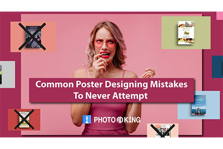
Mistakes to avoid while creating Advertisement Poster
Excessive content assails viewers. Make your advertisement poster simple and clear, letting important information stand out without hiding your message in too much text or imagery.
Using Inappropriate Color Schemes
Inappropriate color schemes may damage readability and brand image. Remain consistent with your brand colors and make sure they complement each other to preserve visual interest.
Choosing Hard-to-Read Fonts
Large or small fonts tire the eyes and lose effect. Select clear typefaces that are simple to read at first glance and do not fade through all poster sizes.
Lack of Visual Hierarchy
Without visual hierarchy, audiences can't instantly know what's most important. Employ font sizes, colors, and white space to guide attention towards your main message and supporting details effectively.
Ignoring Mobile or Screen Responsiveness
Most posters are accessed online. Not designing for screen responsivity could see your design distorted, un-readable, or worse, on different screens, diluting its impact and reach.
Inconsistent Branding
Lack of consistency in branding confuses the viewer and diminishes recognition. Stick to the same logo, typefaces, and colors to promote a professional appearance and reinforce brand recall on all materials.
Conclusion
Designing a successful advertising poster involves the marriage of creative design and strategic copy. This means that every element, from image and type to format and message, must have a function. To market a product, drive action, or build brand identity, your design must meet your audience's and brand's demands. A successful poster does more than catch people's eyes; it communicates and drives action effectively. It converts viewers into buyers.
FAQs
Select size and ratio depending on where your poster will be displayed, digital display needs different ratios than printed posters, and each medium has specific adaptation requirements for resolution and layout.
Utilize good-quality images or illustrations that are subject-specific to your message. Good visuals not only grab attention but also assist in making your poster's central idea work effectively.
Color and font selection will have a dramatic effect on readability and the perception of your brand. They need to be congruent with your brand identity and reinforce the general readability of your poster.
An effective CTA incorporates action-oriented, direct language that informs the viewer precisely what to do next, be it "Sign Up Today" or "Visit Our Store." Make it bold and straightforward.
Provide only the most important details. Keeping your writing brief guarantees that your message is immediately taken in, making the poster better at attracting and maintaining attention.